
Crypto chart patterns look like modern art sometimes. You pull one up and you’re like, is that a bull flag or a kid’s doodle?
But here’s the thing: those squiggles actually mean something. Traders have been studying these shapes forever, and they found out they’re not just random lines—they may tip you off about what could happen next. That’s right, triangles and flags aren’t just for geometry class, they may help you stack a few extra satoshis. However, crypto chart patterns are far from foolproof and fail frequently in volatile markets.
In this guide, we’ll walk through what crypto chart patterns are, how to recognize them, and how to trade them cautiously with proper risk management—let’s get started!
What are crypto chart patterns?
Patterns are simply recurring shapes that prices make on a chart, and you want to notice them because they may hint at what might happen next. Studies of historical data found that patterns sometimes play out with modest statistical significance—meaning they have limited predictive value in certain market conditions. Consequently, traders use chart patterns as one of many signals to plan more informed entry or exit points for the cryptocurrencies they are trading.
Reliability of crypto chart patterns
It’s important to remember that crypto chart patterns are not guarantees.
Research found that while crypto chart patterns may outperform random guessing, don’t blindly rely on them alone. Use patterns as one tool among many, always set protective stop losses at predetermined risk levels, and be ready for the possibility of false signals.
Simply put: when combined with other analysis and strict risk management, patterns may shift the odds in your favor, but they’re never 100% certain and should never be your primary decision-making tool.
Most common crypto chart patterns
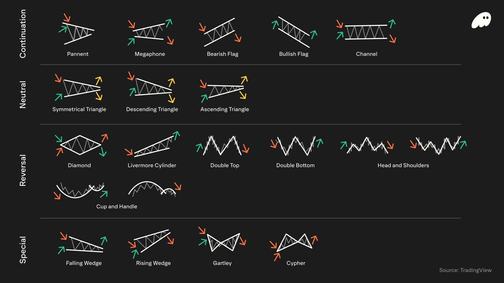
Continuation Patterns (suggest the trend may keep going)
- Pennant: Looks like a small symmetrical triangle. It follows a big price move and sometimes breaks out in the same direction. If you see a pennant, you might see the prior rally or drop continue.
- Megaphone (Broadening Formation): Has at least two higher highs and two lower lows, so it looks like diverging trendlines (a widening “megaphone”). This pattern may indicate volatility is rising. You draw trendlines that get farther apart, and then watch for a breakout up or down. In crypto, an expanding megaphone shape might signal a wild price swing ahead or could just be normal volatility.
- Bullish Flag: After a strong up-move, the price drifts a bit downward between two nearly parallel lines. The lines tilt slightly down. It’s a pause, and sometimes the uptrend resumes. Traders spot the breakout above the flag top as a potential buy signal.
- Bearish Flag: After a sharp sell-off, the price drifts upward between parallel lines that tilt up. The rising “flag” after a drop is a pause in a downtrend. When the price breaks below, it sometimes means further losses are coming.
- Channel: The price moves between two parallel trendlines. If both lines slope up, it’s an ascending channel (uptrend); if both slope down, it’s a descending channel (downtrend). Horizontal channels may also occur (sideways range). In any case, traders often buy near the lower line and sell near the upper one.
Neutral Patterns (no strong bias; can break either way)
- Symmetrical Triangle: Two trendlines converge (one sloping down, one up) forming a triangle. This shows indecision. The breakout can go up or down. Often it ends up moving in the same direction as the prior trend, but it is considered neutral overall.
- Descending Triangle: Flat support on the bottom and a declining trendline on top. Sellers are pushing lower highs while buyers hold one level. This is traditionally bearish (continuation of a downtrend), but be alert, sometimes it can break the other way.
- Ascending Triangle: Flat resistance on top and a rising trendline below (higher lows). This is traditionally bullish continuation after an uptrend, as buyers step in at higher and higher levels.
Reversal Patterns (signal a trend is about to turn)
- Diamond: At the end of an uptrend, the price sometimes forms a diamond shape. The “diamond top” occasionally marks exhaustion of a rally and a pending reversal. That means if you see a diamond forming, it might mean an uptrend is ending and a drop may follow.
- Livermore’s (Accumulation) Cylinder: This is a rare pattern described by Jesse Livermore. Here the price oscillates within a kind of widening “cylinder” (two non-parallel lines that slowly diverge) for a long time, before potentially breaking out.
- Double Top: Looks like the letter “M” on the chart—two peaks at roughly the same level, with a dip between them. This pattern often appears after a long rise and might suggest the buyers may be out of steam. A double top occasionally ends with a bearish reversal (price heads down).
- Double Bottom: The inverse “W” shape—two low troughs at similar levels, separated by a rally. It sometimes appears after a downtrend, potentially signaling a bullish reversal. The pattern indicates that sellers tried once more, failed to push lower, and buyers took control, often driving prices up.
- Head & Shoulders: Perhaps the most famous reversal. This pattern has three peaks: a center peak (head) and two lower shoulders on each side. It might mark a top of a bullish trend. When price breaks below the “neckline” drawn through the two troughs, it could signal a shift from uptrend to downtrend.
- Cup & Handle: It looks like a rounded “U” (the cup) followed by a smaller downward drift (the handle). The cup forms as price dips and then recovers to the old high, and the handle is a brief pullback. A break above the handle’s resistance sometimes leads to a fresh rally, but may fail to follow through. Think of it as a consolidation that might precede a gain or loss.
Special Patterns
- Falling Wedge: This is like a triangle that slopes down. Two descending lines converge. It might suggest a bullish reversal. The idea is that the downtrend could be losing momentum. When price finally breaks out above the upper trendline, it sometimes jumps higher.
- Rising Wedge: Opposite of falling wedge—two rising lines converge. It might signal a bearish reversal after an uptrend. When price breaks below the lower line, it sometimes means prices will slide down.
- Gartley: In practice it looks like an M or W with specific Fibonacci retracements (XABCD). It is used to attempt to pinpoint reversals: for example, point D might mark where the price turns around based on fib ratios.
- Cypher: Another advanced harmonic pattern, also with five points (XABCD). When a Cypher appears to complete, it occasionally signals a strong reversal of the prior move (both bullish and bearish versions exist).
Each of these crypto chart patterns has its own “feel,” and with extensive practice you’ll start to spot them. Remember, these descriptions are brief, and crypto chart patterns can be complex and subjective. But hopefully you now recognize names and shapes!
Charting and trading with Phantom
Now that you know the most common crypto chart patterns and their limitations, you might want a simple way to practice spotting them.
Phantom provides tools for charting and trading with Phantom Perps. Whenever you see a pattern (say a bullish flag) forming, you can go long or short with just a tap or a few clicks.
Download Phantom today, flip through charts, and see if you can pick out patterns as they happen.
FAQs
Disclaimer: This content is for general educational purposes only. It is not financial advice, investment guidance, or a solicitation to buy, sell, or trade any assets, products, or services. Perpetual futures are complex, high-risk instruments that are not suitable for all investors and can result in losses exceeding your initial investment. Not intended for UK audiences.


